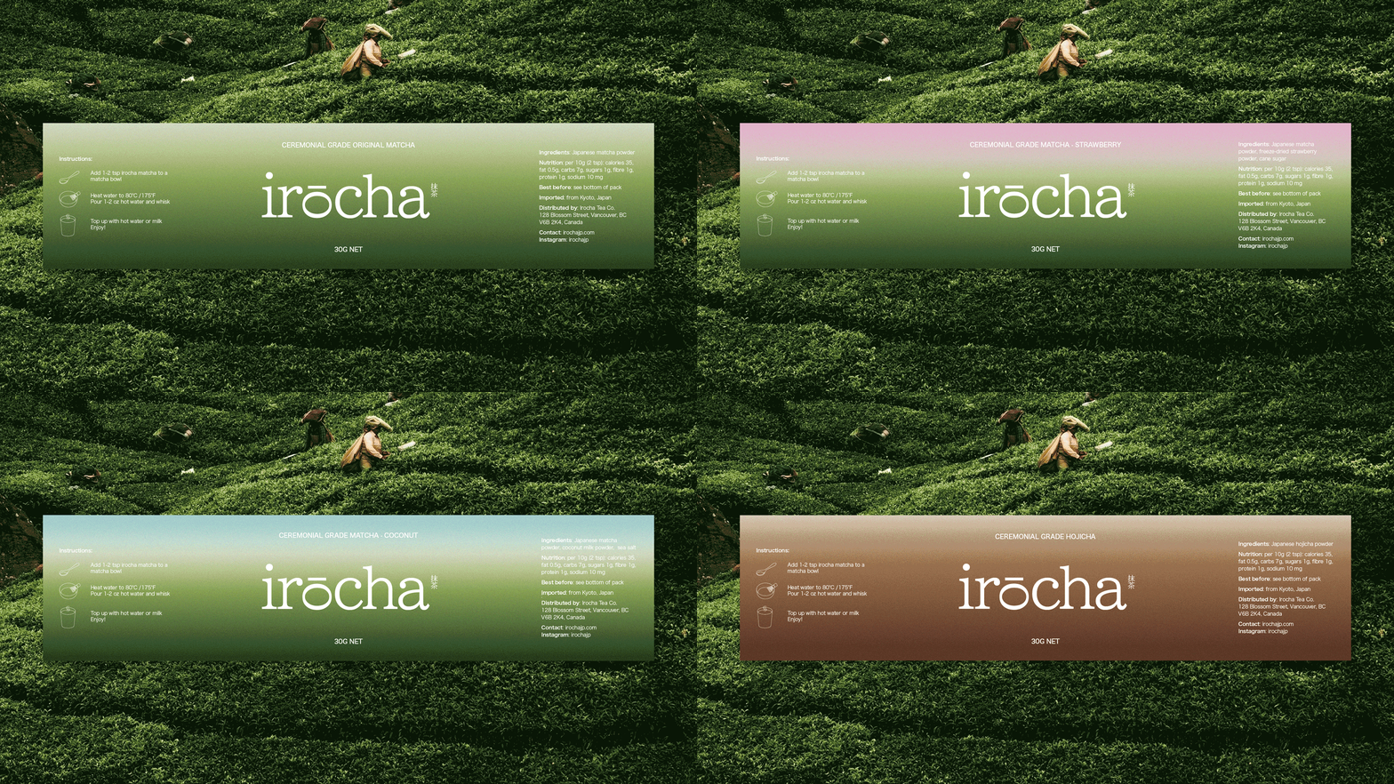
irocha
Irocha is a conceptual Japanese-inspired matcha brand designed to bring a softer, more playful perspective to premium tea packaging.
Duration
Jun 16, 2026
Client
Personal project
Services
#
BRANDING
Brief
Matcha has become increasingly popular among young consumers, especially within café culture, wellness routines, and lifestyle branding. However, many matcha products on the market either feel too traditional, too generic, or too casual for consumers who want something both beautiful and high-quality.

Solution
Irocha was created to fill that space: a matcha brand that feels calm, premium, and design-led, while also offering fun flavour experiences. Each flavour has its own colour palette and mood, allowing the packaging system to feel cohesive but still expressive.
The brand concept focuses on turning matcha into a small but high-end daily ritual. Therefore, I selected New Clear Minto for the logo and headings because its refined serif details create a sense of elegance, craft, and premium quality. The typeface gives Irocha a softer editorial feel, helping the brand feel more elevated than a typical flavoured drink product. Its delicate contrast also pairs well with the calm, Japanese-inspired visual direction of the brand.
For body text, I chose Hiragino Kaku Gothic for its clean structure, clarity, and strong readability across packaging and digital applications. As a Japanese gothic typeface, it supports the brand’s Japanese-inspired identity while keeping the overall system modern and accessible. Together, the two typefaces create a balanced contrast between sophistication and functionality.